
Earlier, if we want to create Rounded Corners in HTML we used to make use of Images to get that effect in HTML and now everything has changed a lot and we make use of pure CSS to render the html box in rounded corner style.
To create rounded corners in HTML, some of the developers still use images to get a box into rounded with the desired color or what ever. For that to render will take so much of time and if at all we miss one of the images the box will look messy.
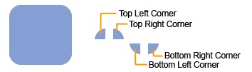
For instance: Check out the below screen shot, if we want to create the rounded corner box. Below is the scenario (this is using Images)
We used to create four images for our corners. Most graphics programs have a tool that will create rounded-off squares. In the spot where you want the box to show up, just create a container div to hold the box, a div for the top row and a div for the bottom row. Between the top and bottom rows, you can add your valuable content to show up in the rounded corner box.
HTML Code:
CSS Code:
I agree this works fine in IE6, Mozilla 1.3, and Opera 7 on Windows. But to render those images might take some time and what will happen if we forgot the image to include or upload, the box looks messy right? Yes!
In these scenarios, you can make use of pure CSS to get that rounded curve with out images. And in no time the box will render perfectly with Rounded Corner, Would you like to know how? “Nifty Corners” has made it possible, below is the code for rendering the HTML box into rounded corners style by using only CSS styles. Isn’t it awesome YEAH! Thanks to Nifty Corners, in helping us in all the way!
Content courtesy “Nifty Corners”:
HTML Code:
CSS Code:
If you want to see the example, how it renders – click here
HTML Code:
1: <div class="roundedcontainer">
2: <div class="roundedtop">
3: <img src="tl.gif" alt=""
4: width="15" height="15" class="corner"
5: style="display: none" />
6: </div>
7: 8: <p>Lorem ipsum dolor sit amet, consectetur adipisicing
9: elit, sed do eiusmod tempor incididunt ut labore et 10: dolore magna aliqua. Ut enim ad minim veniam, quis 11: nostrud exercitation ullamco laboris nisi ut aliquip 12: ex ea commodo consequat</p>
13:14: <div class="roundedbottom">
15: <img src="bl.gif" alt=""
16: width="15" height="15" class="corner"
17: style="display: none" />
18: </div>
19: </div>
CSS Code:
1: .roundedcontainer {
2: width: 250px;
3: background-color: #f90;
4: color: #fff;
5: }6: .roundedcontainer p {
7: margin: 0 10px;
8: }9: .roundedtop {
10: background: url(tr.gif) no-repeat top right;
11: }12: .roundedbottom {
13: background: url(br.gif) no-repeat top right;
14: }15: img.corner {
16: width: 15px;
17: height: 15px;
18: border: none;
19: display: block !important;
20: }I agree this works fine in IE6, Mozilla 1.3, and Opera 7 on Windows. But to render those images might take some time and what will happen if we forgot the image to include or upload, the box looks messy right? Yes!
In these scenarios, you can make use of pure CSS to get that rounded curve with out images. And in no time the box will render perfectly with Rounded Corner, Would you like to know how? “Nifty Corners” has made it possible, below is the code for rendering the HTML box into rounded corners style by using only CSS styles. Isn’t it awesome YEAH! Thanks to Nifty Corners, in helping us in all the way!
Content courtesy “Nifty Corners”:
HTML Code:
1: <div id="container">
2: <b class="rtop">
3: <b class="r1"></b> <b class="r2"></b> <b class="r3"></b> <b class="r4"></b>
4: </b>
5: <!--content goes here -->
6: <b class="rbottom">
7: <b class="r4"></b> <b class="r3"></b> <b class="r2"></b> <b class="r1"></b>
8: </b>
9: </div>
CSS Code:
1: .rtop, .rbottom{display:block}
2: .rtop *, .rbottom *{display: block; height: 1px; overflow: hidden}
3: .r1{margin: 0 5px}
4: .r2{margin: 0 3px}
5: .r3{margin: 0 2px}
6: .r4{margin: 0 1px; height: 2px}
If you want to see the example, how it renders – click here
2 comments:
Posted this link in www.surfurls.com
Thanks Jack, Thanks for adding this into your website... Cheers!
Post a Comment